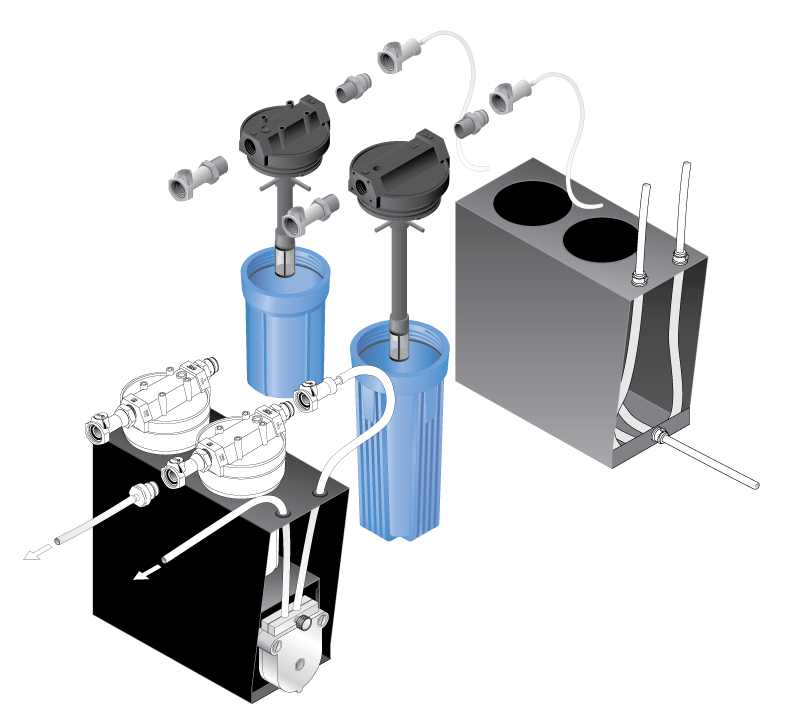
As much as I like 3D modeling and creating photo-realistic artwork, my first love in creating technical art was the isometric drawing. It is art that almost never gets in the way of the story it tells, just conveys its message simply and clearly. For that very reason, it’s the choice for most infographics.
The two most common types of technical illustration are perspective drawings and isometric drawings. Perspective is used for realistic presentations and can be taken to extreme levels of finish. Isometric drawings are the workhorses, perfect for pricelists, manuals and complex informational storytelling.
Perspective drawings are built on real world concepts of a horizon line, vanishing points and foreshortening (tapering) to give a sense of “real” depth and space. The drawing represents a perspective, or point in space, to the viewer. Move the viewpoint slightly and every line changes. So taking a perspective drawing and duplicating it, if we slide the second drawing to the side of the first, the two do not look like they belong together. The second drawing is out of perspective to the first viewpoint.

Isometric drawings (based on the grid shown at the top of this post) are the opposite of perspective. They live in a world of total consistency. No horizon line, vanishing points, or unique point of view. Front, side and top views of each part are scaled, rotated and skewed in specific ways to create objects that can fit together perfectly in numerous ways. Left, right, above, and below each other, they always look like they belong. Perfect for pricelists, catalogs and manuals, where random items need to look good grouped together.

I have created many furniture catalogs and pricelists through the years, with hundreds of illustrations where every drawer configuration, or slight design modification needed its own drawing and needed to align with all the other products in that column of the page. Perspective drawings looked wrong when placed together. Isometrics looked perfect. And, isometrics are the drawing of choice for infographics, because with many different kinds of information in the same place, the uniformity of the isometric look ties everything together in the big picture.
One other option, of course, is the front view drawing. Relatively symmetric objects like centrifuge tubes and pipet tips only need front views because all visual information is contained in just one view. For everything else, that is just not enough visual information for the viewer. Switching to isometric drawings is often the best solution. For some loss of realism, more information can be presented more clearly.
With so much of my current work being 3D models and animation, I sometimes have to point out that the simplest drawing can still tell the complete story. It doesn’t take one word to tell a complete stranger which bathroom is which. And a red diagonal line through a circle never means YES!
I’ve always enjoyed creating isometrics, and have produced thousands in my career. It takes time to develop the best iconic, visual solution, but the result is specific and consistent. And when changes are needed, it’s much more forgiving than perspective for making adjustments. The lines for all top, front and side planes are ALWAYS parallel. It’s foolproof.
Need art for pricelists, brochures, infographics or instructions? I’m your guy. Let’s talk.
Share this:


2 Responses
Robert Hill
Hey Bill,
Been a while. I do read your emails and have been inspired by all you’re doing. I know you keep working with Labcon and that’s great. Hoping you are receiving new enquiries from ‘new’ opportunities. You and Marin should come visit Phoenix. It’s been 110-115 each day for the past 3 weeks of so. Just wonderful weather. Please give me an update on Travis and his wife. Last I heard, things were real positive and am hoping the same is true today. He deserves to live a ‘normal’ life with his beautiful wife. Same to you as well!!!!!
Bill, what was it, 1988? when we first met. 31 years ago? Wow, time flies and we’re still 39 years old?!!
Love ya man…..Bob
bgob1
Thanks, Bob. I did a lot of these drawings for you back in 1988. Good times!